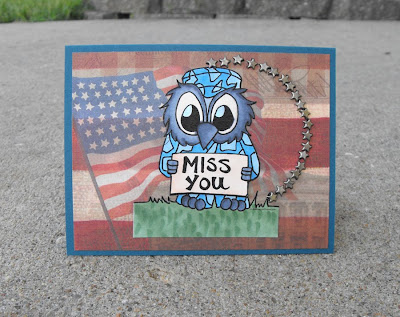
 Here's another card featured in this month's SheetLoad. You know you don't HAVE to stick with a literal interpretation of the sketch? I know, who knew!!! A sketch is designed to give you inspriation. I loved the background paper so much I didn't want to cover it up, so I lieu of covering it up I replaced one of the sketch elements with a circle of brads. To see a full list of supplies go check out the September issue of SheetLoad.

1 comment:
Love it! I like how you colored the image blue and how well it works with the Stars and Stripes!
Post a Comment